SaaS features page, also called product or solutions page is part and parcel of any SaaS website.
Imagine visiting an online store and not finding information about a product you like. You will probably leave the website and blame the owners for not providing enough details.
SaaS users also need to know what benefits your product offers before they start a free trial.
Today we will discuss the SaaS features checklist with the following points and best practices of the best SaaS sites:
- how to structure your SaaS product page,
- what elements to include to increase conversions,
- will look at several pages for features and benefits examples so you can boost your creativity and generate ideas for your website.
3 Approaches of How Should Your SaaS Features Page Look Like
You may have only one SaaS product features page with all the information and details listed there. Or you can have multiple feature pages—one for each solution you offer or the buyer persona you target.
Let’s explore the possibilities and observe the SaaS features of product pages. And for learning more, you can read about SaaS website structure.
For simple products
In some cases, a SaaS product may provide the same benefit to its users, no matter what business they do.
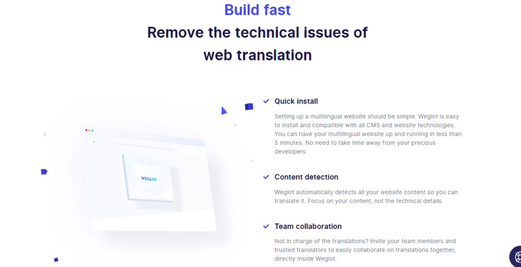
For example, translation software makes your site multilingual so you are able to speak to foreigners in their native language.
Whether you are a hotel or a freelance photographer, your end goal is to make your website understandable for potential foreign buyers.
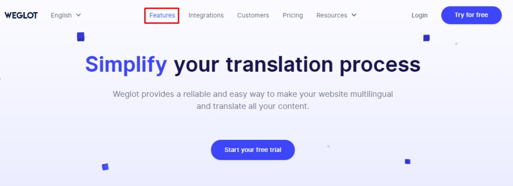
Here’s an example from Weglot.
They have only one page with a title, explanation, CTA, and list of the features/benefits in bullet points.
But everything is not always that simple.
SaaS Features Checklist For Multi-Feature Products
Sometimes one company may offer two or more tools that solve different problems. And the user needs to know what to expect from each of them.
Consequently, the company website should list the benefits of each tool—preferably on separate pages.
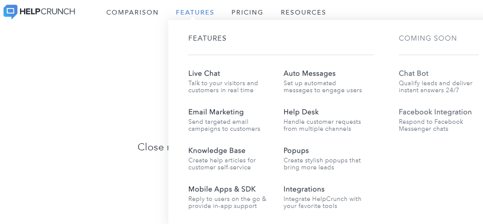
For example, HelpCrunch is a customer communication platform for support and offers multiple products – live chat, knowledge base, email marketing tool, pop-ups, chatbot, etc. They have a features page for each tool they provide.
Of course, you can combine all product features under one roof and list them on one page. That depends on how many tools you offer and how many details you need to write about each of them.
Further reading: The Importance of Customer Reviews for E-commerce Stores
For Multi-Buyer Persona Products
Another case that requires having more than one SaaS features page is for different buyer personas.
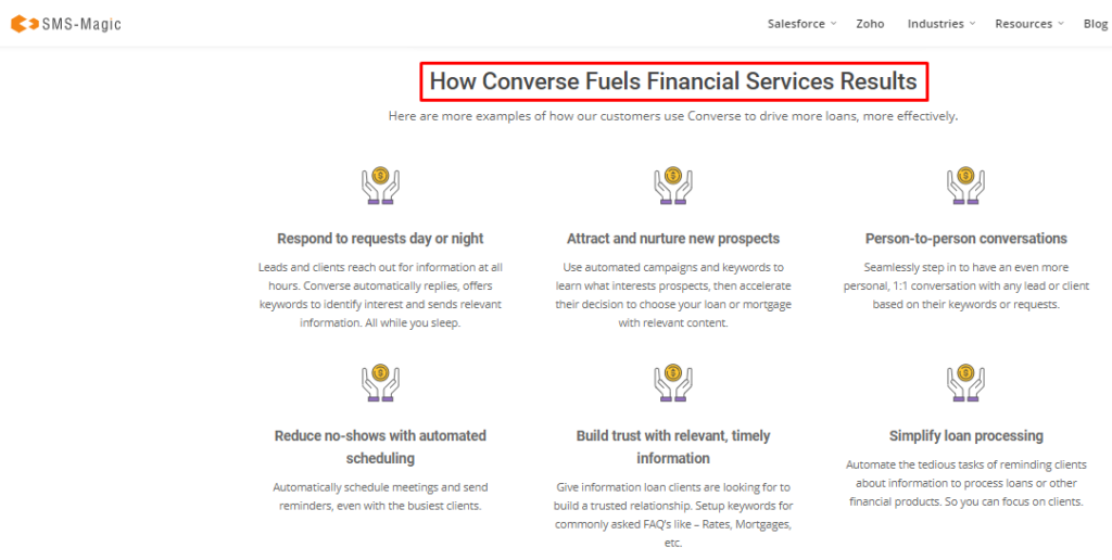
For example, SMS Magic is an SMS service provider. They work with financial institutions, educational centers, healthcare and wellness businesses, etc.
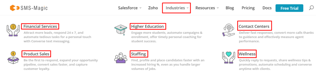
Each institution solves unique problems with that same service, so listing the same benefits for all target groups won’t look professional.
When addressing financial institutions, SMS-Magic says they can use text messages to drive more loans, answer customer queries based on keywords, etc.
When addressing healthcare centers, SMS-Magic mentions they can remind customers of booked appointments and update them on new products, discounts, etc.
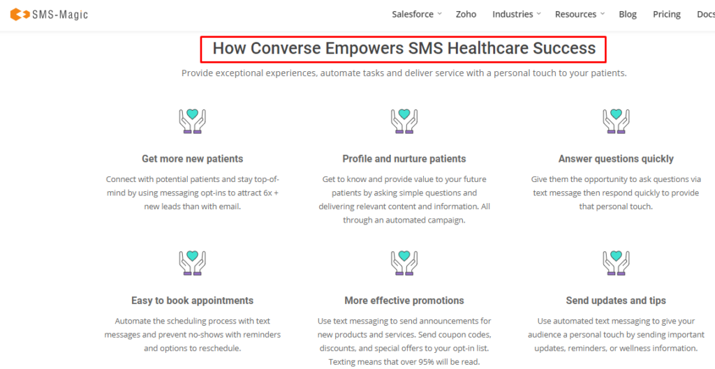
Do you see how different the needs are? The problems these institutions are solving aren’t similar, and consequently, different benefits should be emphasized.
Allocating separate feature pages for each of your target groups helps your visitors find their “group” easily and not read redundant information.
Do you want to learn if your SaaS feature pages are correctly structured and optimized? Contact us to find out.
SaaS Features Checklist: 7 Elements of SaaS Features Page to Increase Conversions
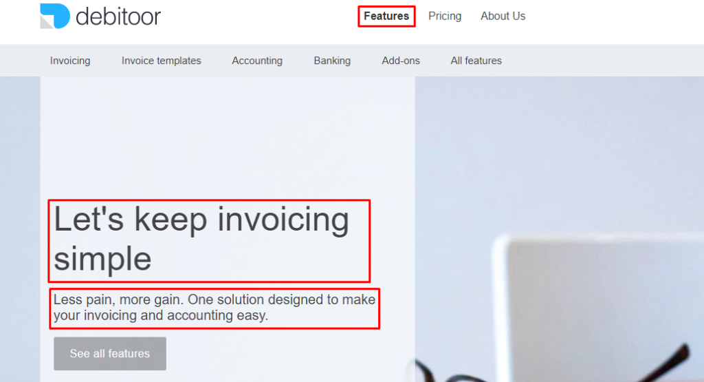
1. Title & explanation: Every product page should start with a promising statement and encourage the visitor to view more. Here’s an example from Debitoor:
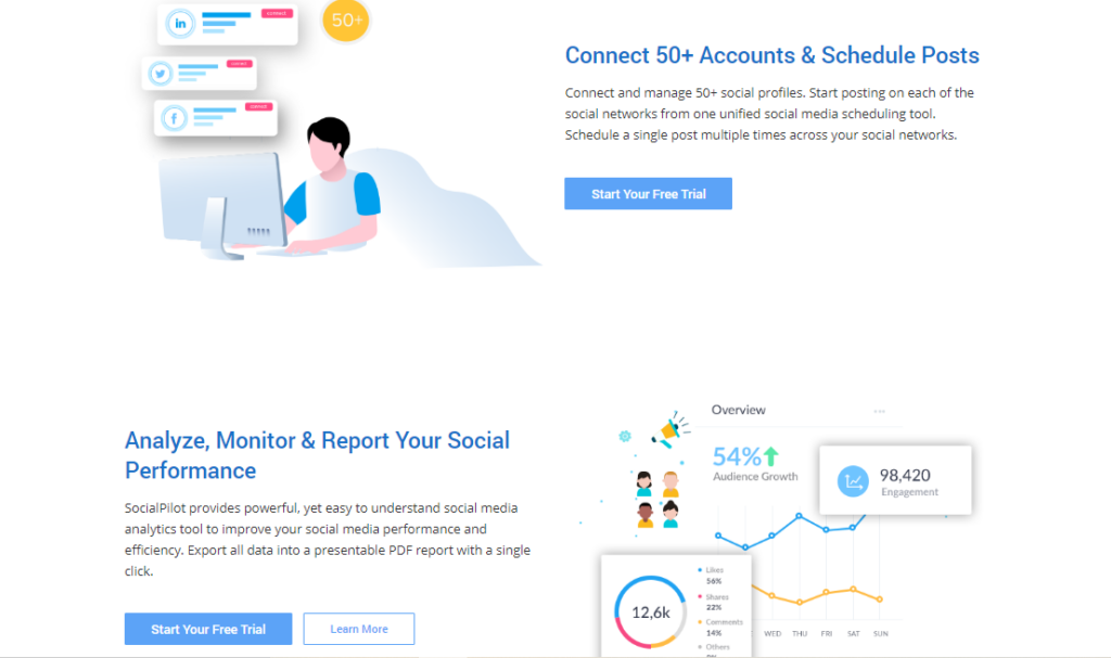
2. Design: According to the best practices of the best features page design, your SaaS features page should be divided into two columns. You will write the benefits in the first column and add a corresponding image to the second column. See an example from SocialPilot below:
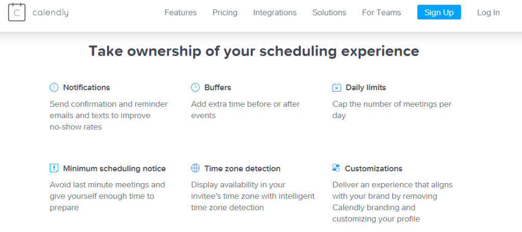
To enrich your SaaS product landing page visually, you can use illustrations, product dashboards, and icons that correspond to the statements you make. Here’s how well small icons go with Calendly’s statements.
3. Specific language: As we mentioned above, your copy should address specific groups who have X problems and look for Y solutions. Use the word “you” frequently, but make sure you know who they are and show your product is for them, not others.
4. Feature<benefits: Best SaaS product pages don’t leave visitors with questions. They mention features but don’t forget to clarify what the benefit is behind it.
Here are website feature examples from Zervant.
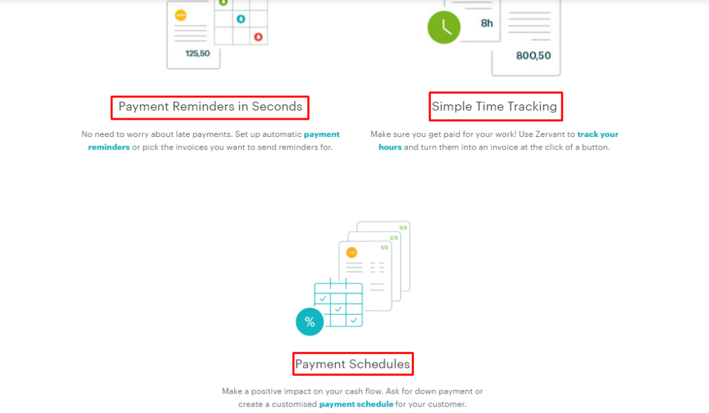
“Payment reminder” is the feature. The benefit is that users can automate the reminder process and don’t worry that they will get paid later than expected.
5. Testimonials/ratings/customer logos: If a visitor lands on your features page, he/she is someone interested in your product, not just in your blog or resources.
You should take the chance and show that you are a trustworthy partner for hundreds of businesses.
We are social beings and give weight to what people say about others. Especially when “other” is a business you think of partnering with.
6. Product videos (optional): Adding videos to feature pages is not so common, but maybe you can do it to stand out.
If you decide so, make sure your video(s) is short, clear, and is directing the visitor to take action instead of distracting.
7. Call-to-action: Finally, that’s what your team is waiting for! Get people to click your CTA and start a free trial, book a demo, or simply subscribe.
Bear in mind that your CTA shouldn’t appear only once. You can have it multiple times throughout your product page copy.
The number mainly depends on your copy length. If it’s short, 2 times may be enough (in the beginning and in the end).
If you have many features to talk about and too many advantages to list, you can take advantage of space and encourage action multiple times.
Here is what Jeilan Devanesan, Content Marketer at Venngage, says about creating a features page:

“A great features page speaks to a highly specific audience, identifying the problems it faces and the solutions your tool provides through informed copy and visual examples.One thing you can do is to have calls with your ideal users and have them describe in their own words how your feature/tool solves their problems.
Then incorporate the language they used to describe your tool into your landing page. This takes the guesswork out of writing landing page copy.
You can then complement the copy with relevant screenshots, gifs and other visuals of your tool to really drive the point home. With some optimization and research, some of our higher-performing features pages see conversion rates close to 8.00% which isn’t too bad!”
Still don’t have a features page on your SaaS website or plan to redesign it? Contact Andava’s web design and development team and we will discuss how to turn your product features into high-converting sales copy!