Do you track how many websites you visit every day? You stay longer on websites where it’s easier to find what you need, where there’s no information overload and you are addressed with a friendly tone.
Since you are a SaaS company, today we are going to introduce you to the top SaaS website pages. They are sections/pages that need to be part of any SaaS website design:
- Homepage,
- About page,
- Features page,
- Pricing page,
- Landing page(s),
- Thank you page(s),
- Resources page,
- FAQ page.
They will shed light on your company’s activity and your product’s features, helping your visitors enjoy their time on your site.
After all, your goal is to retain visitors on your site, give solutions to their problems, and gain new subscribers, right?
Let’s start exploring our quick guide on how to make a SaaS website and look at some inspiring examples of the best SaaS websites.
Launching your SaaS product website: Top 8 pages you need to have

1. SaaS homepage
Your homepage usually provides the first touch with your future customers. They visit it to understand whether your product provides solutions they are looking for. And if yes, why you are the right fit for them and why they should choose you over competitors.
A perfect structure for a SaaS homepage usually includes the following elements:
- Your logo at the top of the page – Your logo is associated with your brand and inspires trust. That’s why it should clearly and easily be visible to your visitors. Usually, it’s at the top left or right of the homepage.
The menu is usually at the top right and directs visitors to your website’s most important pages (pricing, resources, etc).
- A hero section with a title, short explanation, and an image – Your main title can be a promise, a question or just a statement. The text coming after should explain your title in clear words and show the main essence of your product. See below an example from Adversus.“Improve outbound calls today” is the main title. “We help call centers boost KPIs, make better decisions based on insights, and manage contacts more wisely” is a quick explanation of the product’s mission.
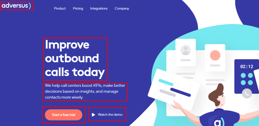
The image of the hero section is usually a large banner that relates to the product you sell. Adding a human presence in our image is highly recommended. - CTA buttons – Visitors saw what you do and how you do it. Now it’s time to show them what to do, where to click.
A perfect CTA for a SaaS product website can be “Start your 7-day free trial”, “Book your demo today” or something similar.
Remember to include the same CTA throughout your website copy multiple times. The more frequently users see it, the more inclined they will be to click it. - What are the elements of a SaaS website social proof? Of course, logos, testimonials, ratings – Include the logos of companies you have worked with, customer testimonials with customer’s name, company name, and preferably an image.
Testimonials show that other people have chosen you previously and your service was worth leaving positive feedback.
Then, you can add on which high-authority websites your product has been featured. Lastly, you can show what ratings it has reached on software review sites like Trustpilot or Capterra.
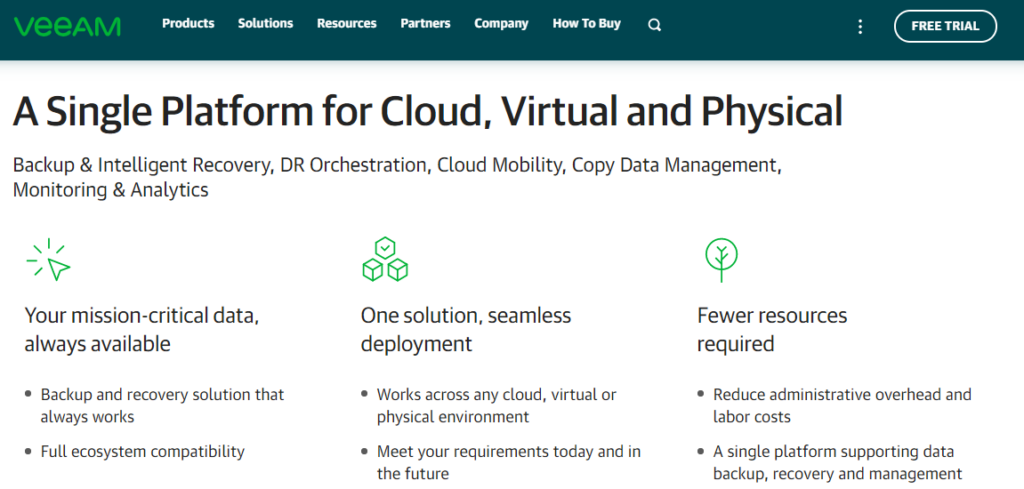
It encourages people to be comfortable with your brand and show you as a trustworthy partner. - Benefits your product provides – Visitors probably won’t try your product because it has been built by “professional enthusiasts”. Nor because you have invested too much in its development.The biggest motivator for visitors is personal – how your solution changes the way they and their team members work.You can add your product’s advantages and benefits only in a few lines as you have a whole features/product page to talk about them in detail. You can see below what benefits and advantages Veeam mentions on their homepage:
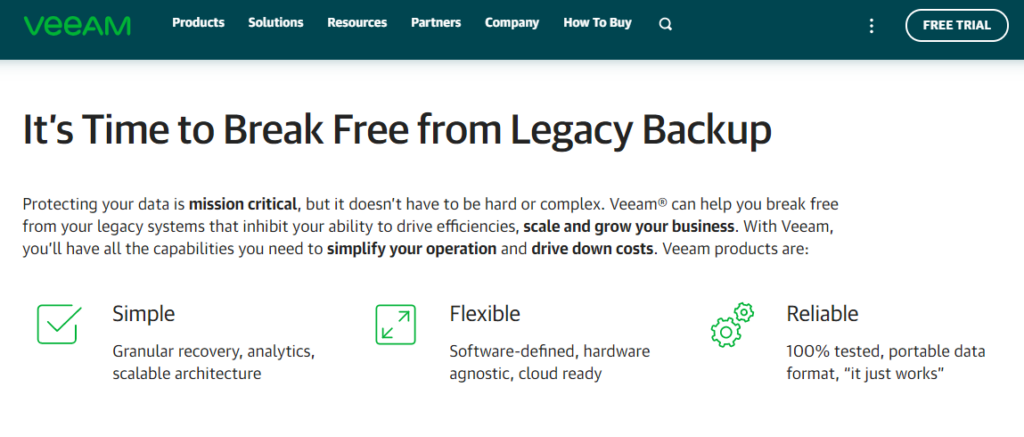
And this one:
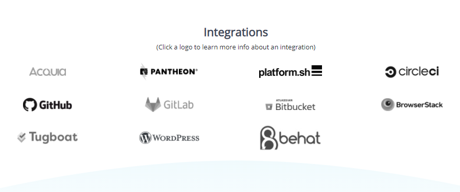
Available integrations are also benefits that your users are looking for. You can mention them on the homepage as well as it’s visible on Diffy’s website:
2. SaaS about page
Here’s where storytelling takes the stage. You can mention official facts (foundation date, city, etc) but talking about the reasons will leave more lasting impressions: how did you decide to found the company, what problem did you notice that people around you were facing, etc?
You can also talk about your company’s values as it’s important not only for your clients but also for your future team members.
3. SaaS features page
Feature titles + benefits in 2-4 lines + small icons = working approach. The less you write, the higher your chances of having your copy read. Below is an example from Diib.

They not just mention what features the product has but clarify why they matter and how one can see value from their existence.
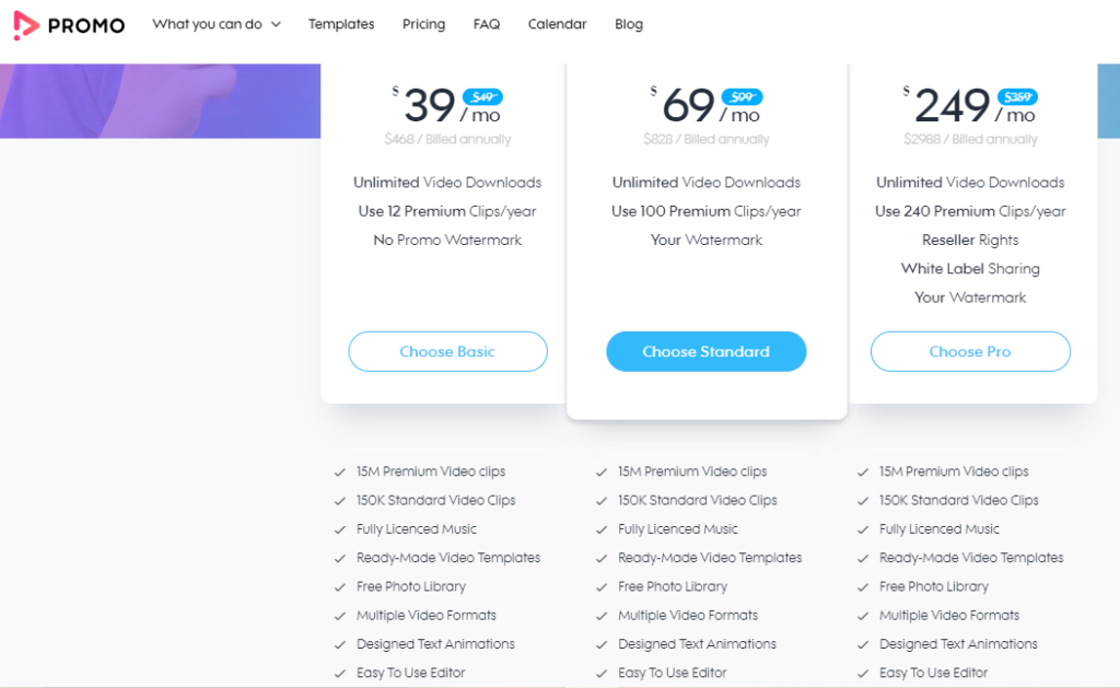
4. SaaS pricing page
Designing a pricing page requires not only financial calculations but also knowledge of human psychology.
Don’t offer too many pricing plans because too many choices confuse people and make the decision process harder.
Under every pricing plan, include what features are included and put a CTA to encourage people to sign up.
Other elements of a high-converting pricing page include an FAQ section and user testimonials.
5. SaaS landing page
Landing pages are responsible for conversion and sales. For a SaaS website, the conversion is when a visitor books a call or signs up for a trial.
Landing pages are also designed for lead generation. It’s the process when visitors provide their personal details (name, company, email) in exchange for something valuable and usually free.
Your landing pages should have short forms and ask only for the most essential details.
For example, asking your visitor’s email and name is a must-have so you can send them personalized emails. But knowing his/her address, zip code, and even phone number isn’t compulsory.
The length of your forms also depends on what you give in return. One won’t provide too much info to see a quick infographic.
But if you offer a free and fresh industry report with statistics, visitors will be willing to provide more details (like phone number) to get it.
Landing pages aren’t limited only to forms. If you offer a resource, you also need to include some info on what’s included in it and what benefit the visitors will receive.
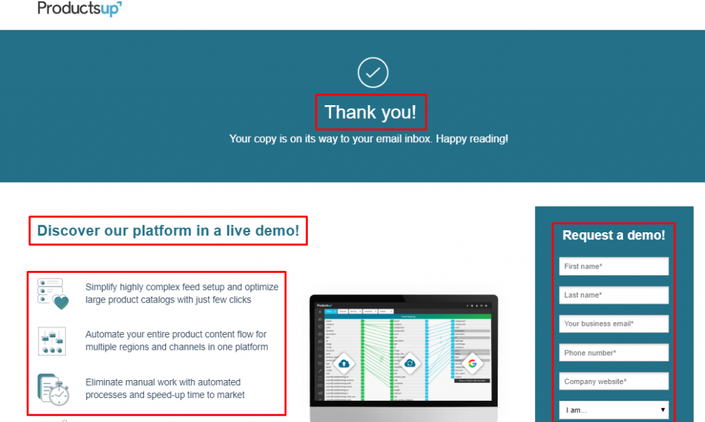
6. SaaS thank you page
One of the most underestimated pages of any website.
Don’t simply say “Thank you” when someone downloads your ebook or signs up for a webinar. Redirect your users to a new page where you make a new offer and ask for another action.
Think about it – your visitor already found something useful on your website and shared his/her personal info. Take advantage of the situation and try to win his/her heart even further.
7. SaaS resources page
This is your hub of ebooks, templates, guides, or any other lead magnets that help you generate leads.
This is a place where you educate your visitors not just about your product but related topics your audience is interested in.
For example, if you were selling a social media scheduling tool, you’d provide resources on how to use social media effectively.
You can require your visitors to submit their names and email addresses and download the free resource they want.
Thus, you generate leads and will be able to promote your software to their email addresses.
8. SaaS FAQ page
Think everything clear is to your visitors? Well, it’s not.
They may have questions about payment, discounts, functionality and an FAQ page can instantly provide answers to multiple questions.
Besides, if your FAQ section includes strategic phrases, you’ll rank better on Google and even ensure spots on featured snippets.
Need help with developing your SaaS website?

Ensuring a great SaaS website design isn’t easy.
That’s because the process isn’t just about hiring a designer, developing a beautiful mock-up and sending it to your developer. Beauty or good taste don’t guarantee conversion and business growth.
Your team should work closely to turn your website into a system that has user-friendliness and profitability in its heart.
Andava is the SaaS website design agency that will replace expensive full-time marketing/design/development teams.
Nor will you be forced to work with multiple freelancers who are in different locations and don’t communicate properly.
Don’t wait anymore. Tell us about your business needs now!